| Variable | n | Mean | SD | Min | Q1 | Median | Q3 | Max |
|---|---|---|---|---|---|---|---|---|
| setosa | ||||||||
| Petal.Length | 50 | 1.46 | 0.17 | 1.00 | 1.40 | 1.50 | 1.58 | 1.90 |
| Petal.Width | 50 | 0.25 | 0.11 | 0.10 | 0.20 | 0.20 | 0.30 | 0.60 |
| versicolor | ||||||||
| Petal.Length | 50 | 4.26 | 0.47 | 3.00 | 4.00 | 4.35 | 4.60 | 5.10 |
| Petal.Width | 50 | 1.33 | 0.20 | 1.00 | 1.20 | 1.30 | 1.50 | 1.80 |
| virginica | ||||||||
| Petal.Length | 50 | 5.55 | 0.55 | 4.50 | 5.10 | 5.55 | 5.88 | 6.90 |
| Petal.Width | 50 | 2.03 | 0.27 | 1.40 | 1.80 | 2.00 | 2.30 | 2.50 |
5 Descriptive Statistics
Descriptive statistics are the first step in a statistical analysis of a data set. The idea is to explore the data set to find possible patterns and relationships which can then be tested during the inferential stage of the analysis.
5.1 Definitions
n : Number of observations
Mean : The average of a set of numbers.
Range : highest score \(-\) lowest score
Standard Deviation : The average distance of the scores from the mean.
First Quartile, Q1 : The number that cuts off the bottom 25% of scores.
Median, Q2 : The middle score once all the scores are placed in order.
Third Quartile, Q3 : The number that cuts off the bottom 75% of scores.
Min, Max : Minimum and maximum scores.
5.2 Example
Table 5.1 displays summary statistics for two quantitative variables of a data set that contains measurements of iris flowers. Summary statistics have been made for each group (species) in the data set.
5.3 Statistical Plots
Statistical plots are used to explore patterns and relationships in data. These include differences within and between groups, and associations between variables. Plots can suggest whether observed patterns are large enough compared to variability to be more than sampling noise. They are also useful for identifying potential problems with data such as skew, outliers, and missing data.
5.3.1 Statistical Plot Summary
?tbl-stat_polt_summ lists common statistical plots, the variables they require, and their uses.
| Plot | Variables | Uses |
|---|---|---|
| Boxplot | One quantitative variable; one grouping variable | Compares spread within groups; identifies outliers |
| Histogram | One continuous variable | Identifying the population distribution |
| Scatter Plot | Two continuous variables | Identifying relationships between variables e.g. linear, non-linear; identifies outliers |
| Line Plot | One continuous variable; time with regular intervals | Observing change over time |
5.3.2 Boxplot
Boxplots are used to
- show the distribution of data for each quartile of a quantitative variable.
- identify outliers
- compare groups
The boxplots in Figure 5.1 show the distribution of Sepal Length grouped by species.
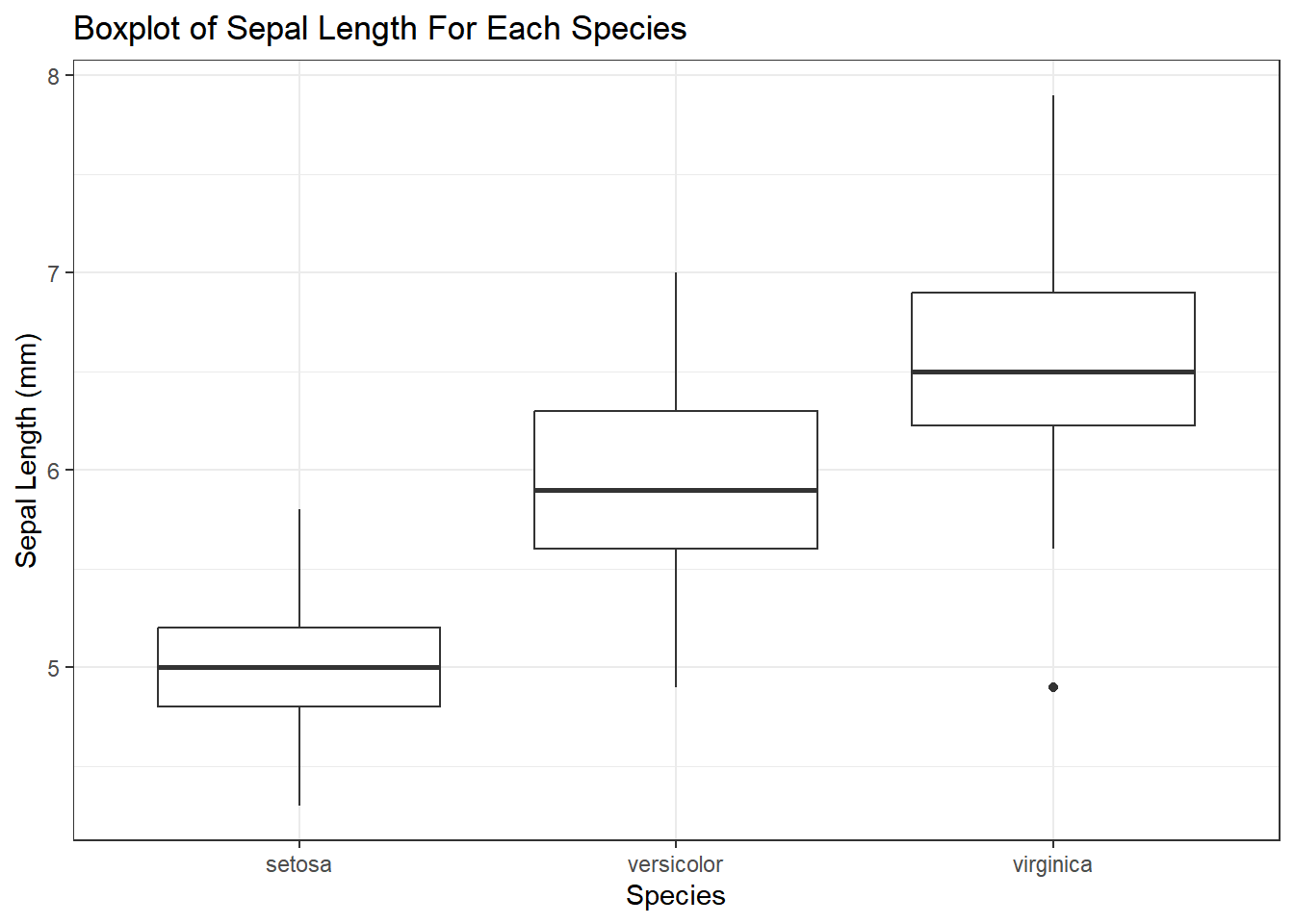
From the boxplots it could be hypothesised that the three species have different mean sepal lengths. However, a statistical test would need to be applied to confirm that there is no real difference in sepal length between the species. The boxplots have also identified an outlier in the virginica group which might impact the results of statistical tests and models.
5.3.3 Histogram
Histograms are used to help identify the type of distribution from which the data was drawn.
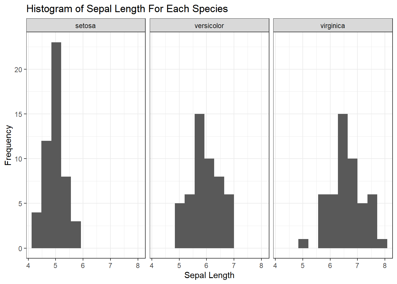
The histograms in Figure 5.2 confirm that the distribution of Sepal.Length is approximately symmetrical for each species. This suggests that a normal distribution would be an appropriate model in each case. Also notice that there is an outlier in the virginica species, as was identified by the boxplot.
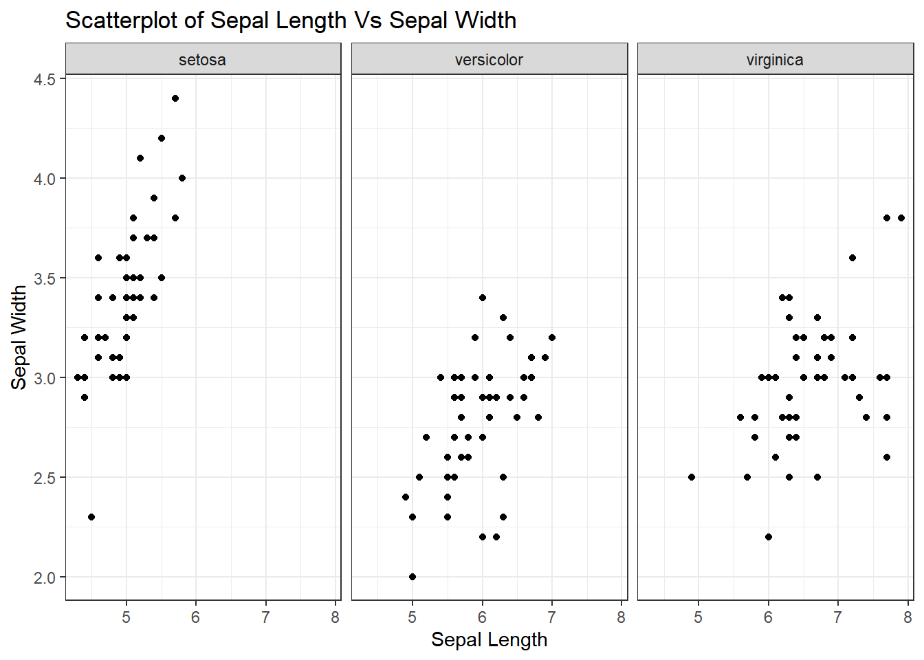
5.3.4 Scatter Plot
Scatter plots identify relationships between quantitative variables. If the relationship is linear, it is usually described in terms of the strength of the correlation and the direction of the relationship e.g. “strong positive” or “moderate negative”. Figure 5.3 shows the relationship between sepal width and sepal length for three Iris species.
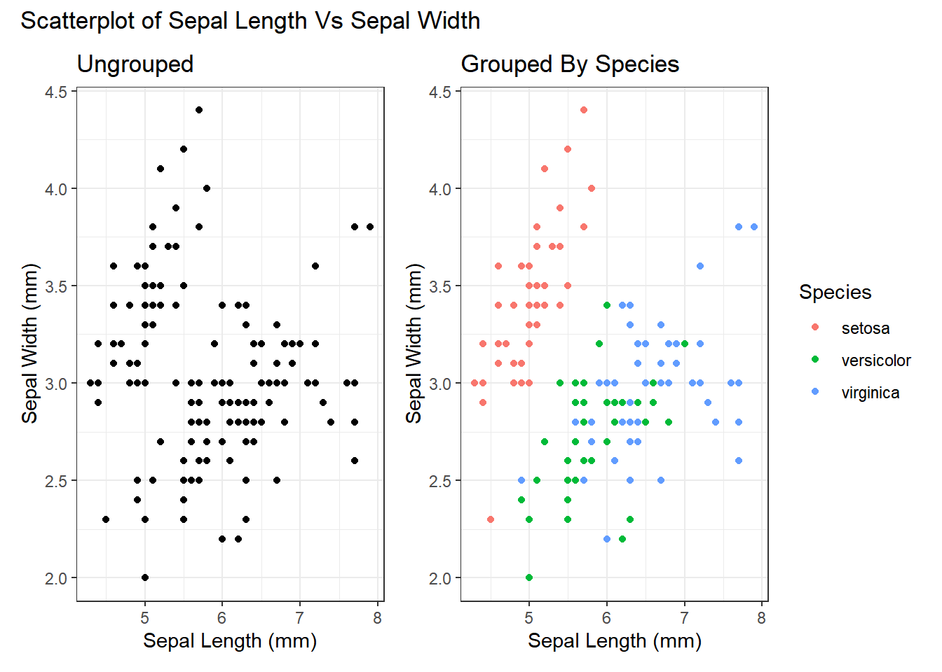
Scatter plots can also include a grouping (qualitative) variable using colour or different point symbols. This can be useful for exploring relationships between groups in the data set, as is demonstrated in Figure 5.4 .
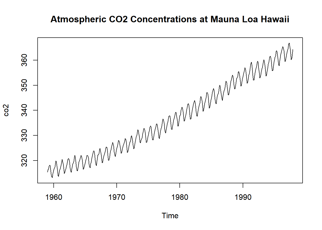
5.3.5 Line Plot
Line plots are used for time series data e.g. daily temperatures in March.
Figure 5.5 shows the concentration of atmospheric CO2 at Mauna Loa, Hawaii. The regular up-and-down is the seasonal variation, and the upwards slope is the trend.